The project covers logo design, creative packaging design, key visual design for communication and product illustration for the new product in the Unilever Turkey ice cream portfolio under the Algida brand.
The challenge is to present the product as a guilt-free, revitalising and fun treat.
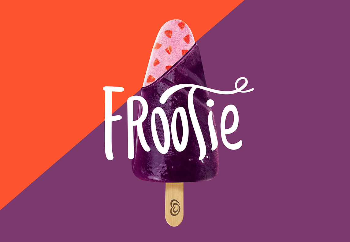
As the brand name Frootie gives reference, the main feature of the product is fruit chunks in the ice cream and the fruit sorbet covering.
GLBA Istanbul partner Orhan Irmak Tasarim aimed at emphasising the fruits on the packaging using strawberry and mulberry pieces as a pattern. Contrasting colors used on the background pops the fruits.
The diagonal division of the colours give reference to the products section, which helps us to show the consumers inner ice cream.